Nero Waffles
Services: Photography, social media, print design
Timeline: Monthly design support
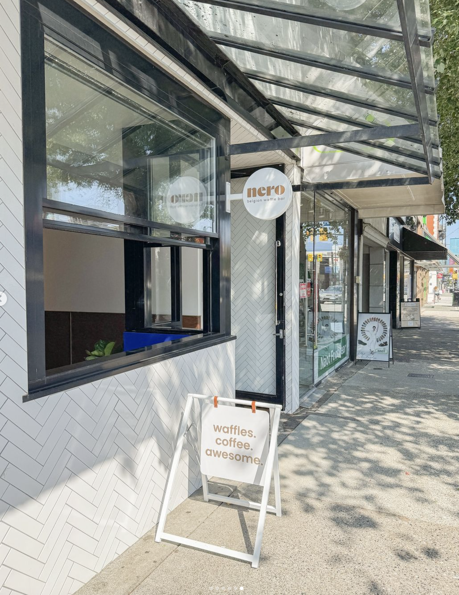
Back in 2022, as restaurants across the city worked to re-adapt post-pandemic, Nero sought to streamline and refine its branding. After years of multiple design iterations from different contributors, the goal was to unify and simplify its identity while preserving key brand assets.
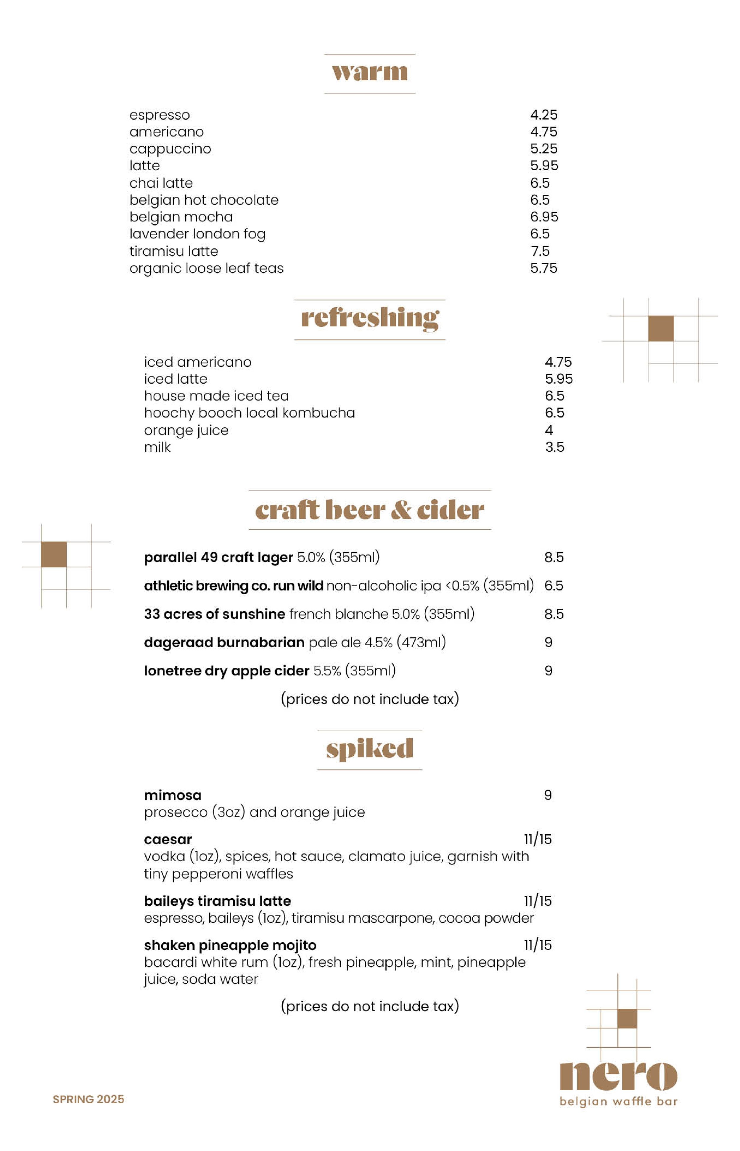
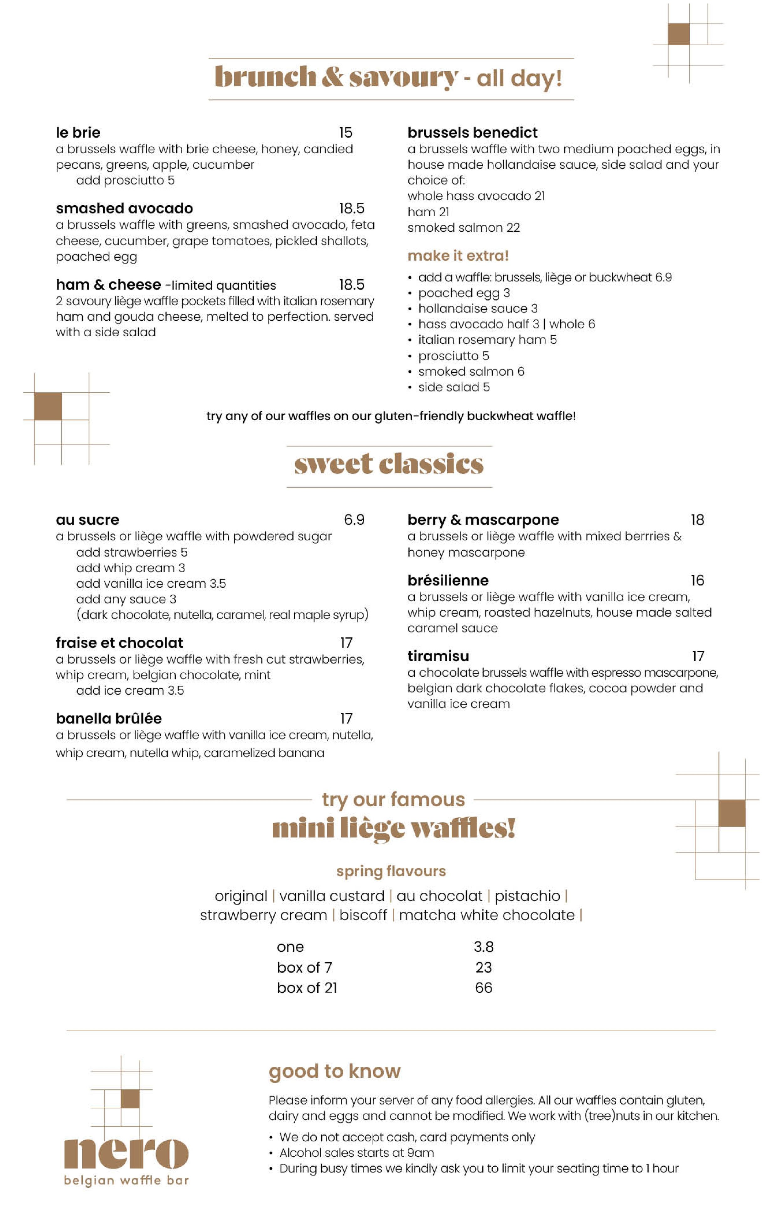
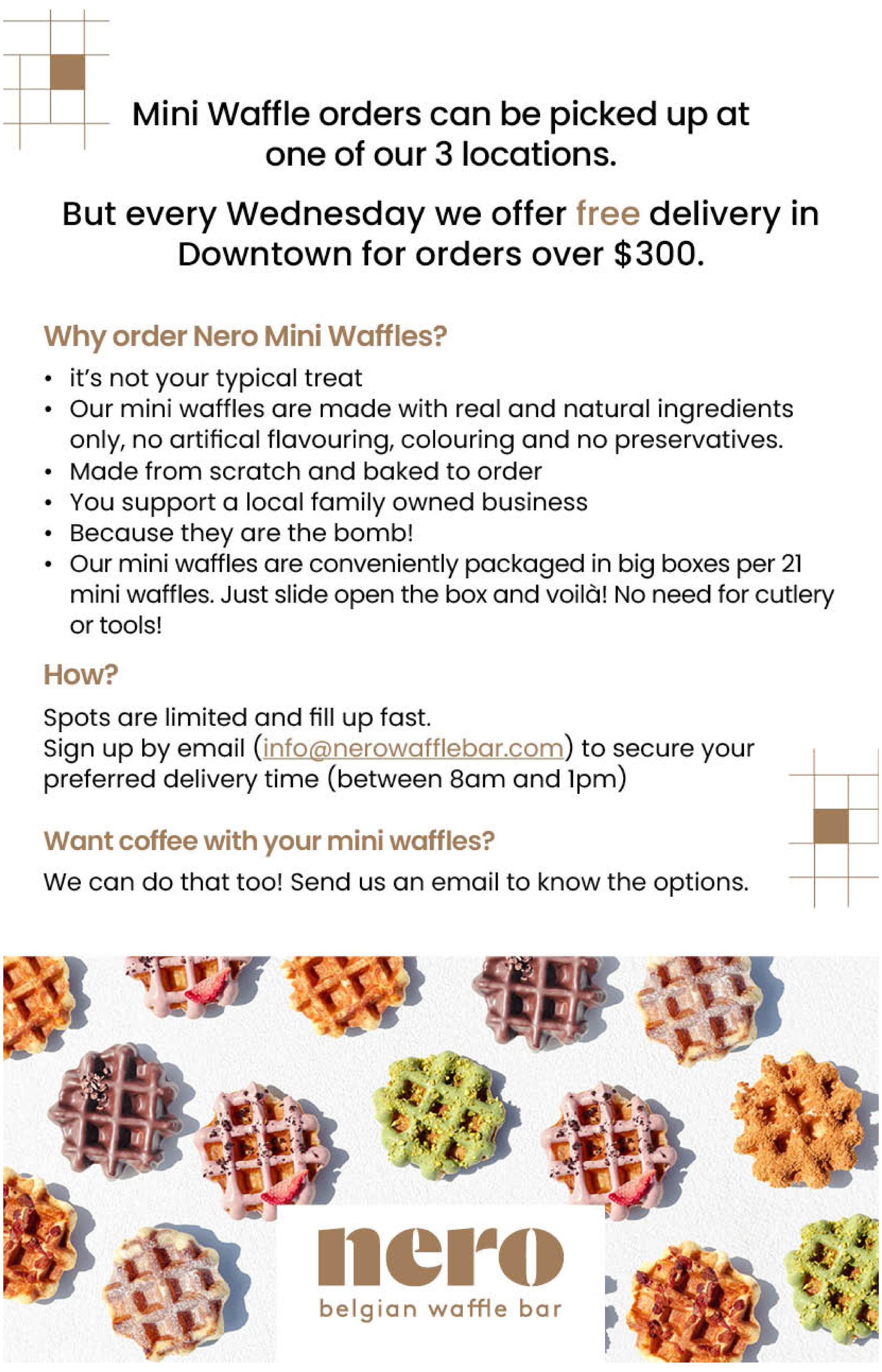
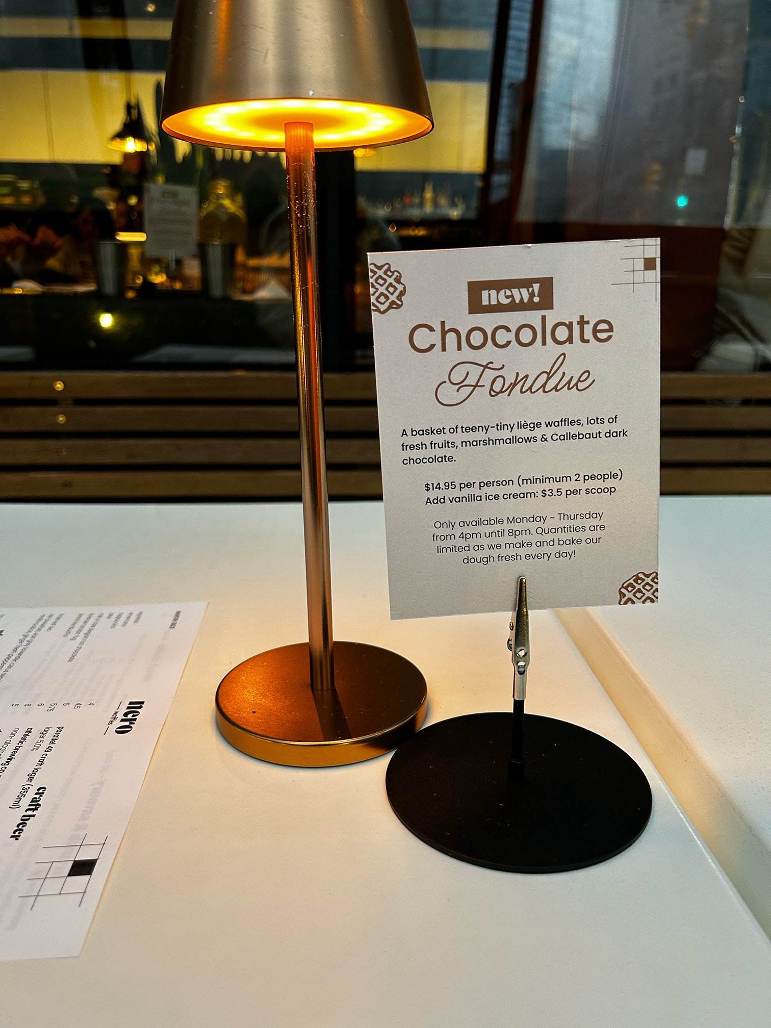
As a FOH Manager, the goal was to simplify day-to-day operations by designing a clear, user-friendly menu and effective signageto improve customer experience. I developed a brand guidelines document with a minimalist color palette and typography that reinforced Nero’s statement: “More waffles, less worries.”
The more consistent brand identity resonated with customers, strengthening their connection with the restaurant across menus, signage, merchandise, and website.